Methodical Monday
Double-click on any image to view it full size. Click the back-button to return to your place on this page.
Greetings!
From time to time, I have been asked what process I use to prepare an image for publication in these photo-essays. Several readers commented favorably on one of my hummingbird images from last week – one which I almost left out – and since it was also one which needed quite a lot of work, I thought it might be interesting to walk you through the process. This process works well for me, but is by no means the only possible approach. My explanation of the technicalities is limited both by space and by my own limited knowledge so my oversimplification may offend some of you, but I hope does not contain any fundamentally incorrect statements!
So image #1 is the subject image “straight out of the camera”, or to be a little more accurate, the way the .NEF file looks immediately after opening it in Lightroom.
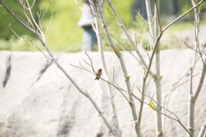
Without devoting an entire essay to somewhat arcane technical matters, let me just say that an .NEF file is Nikon’s version of .RAW format. The information that is captured by a digital camera’s sensor is not a visual image, but rather a collection of digital “bits” of information. In order to see the image, that data has to be processed in some way. The picture that you see on your camera’s LCD screen is generated by the computer within your camera, and by the time you see that picture, the computer has already made certain decision about how to interpret the data, and has compressed it. Simple cameras will then simply record that processed image, as a JPEG file, on the camera’s media. More complicated cameras, however, offer you the option of recording either that processed image as a JPEG, or recording the complete set of data in a RAW or NEF file, or both options at the same time. The advantage of a JPEG file is that you can see it in many popular photo viewing and editing software applications, and the file size is relatively small. On the other hand, because it has recorded only a compressed version of the processed data, the ability to make adjustments to the image are relatively limited, compared to the underlying RAW or NEF file. A more sophisticated viewing/editing program – such as Lightroom – is needed to see a RAW/NEF file, and typically it, like the viewer in your camera, will make certain processing decisions in order to make the image look attractive. However, unlike the JPEG version, those decisions can be adjusted more effectively, since all the data is still available. Therefore, having decided that a particular image is worth optimizing, my first action is usually to apply a specific group of adjustments to the file. This set of adjustments, which is based on a set I found recommended in a tutorial, attempts to restore the image to its “natural” state. In addition, it uses Lightroom’s built-in capability to correct the image for the optical distortion (eg pin-cushioning or barreling) and chromatic aberration of the specific lens used for the image, matching the lens data from the image metadata with information about that lens stored within the program. It does that, plus sharpening the image and adding a little “clarity” and “vibrance” (both Lightroom jargon words) , with a single mouse click. The result of that click is shown in image #2.
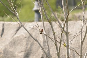
Since, in this case, the part of the image I am interested in – the hummingbird itself – occupies just a small part of the frame, my next step is to crop the image. Most editing software offer the ability to crop to one of a range of standard formats (eg 8×10, 5×7, 4×6, 16×9 etc) or to a custom format. The advantage of a standard size is that most of them correspond to standard paper sizes and photo frame mat opening sizes. Personally, I like the 16×9 format for many subjects (because it fills my computer monitor completely, and matches many newer TV screens), but as yet it is quite difficult to find ready-made frames and mats to fit that format. 16×9 seems to work well with many landscapes, and with the majority of aircraft, birds, and insects, but in this particular case, 5×7 worked better. The result is shown in image #3.
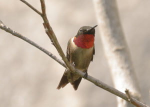
Even though cropping means throwing away part of the image (in this case, most of it!), most image viewing software will automatically enlarge the cropped area to fill the screen as much as possible. The amount of cropping and consequent enlargement that can be achieved without the final result suffering from “pixelation” will depend on the number of pixels of the camera sensor.
The next part of my workflow is aimed at “developing” the picture itself. I am essentially duplicating what the processor within the camera does to generate the JPEG on the LCD screen, but now I am in complete control of the process. The first step is to work with the “tone curve” (at least that is Lightroom’s name for the feature), which allows me to decide how close to “absolute white” the brightest parts of the image will be, how close to “absolute black” the darkest parts will be, and to control the amount of contrast in the image. This results (in this case) in image #4.
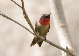
(Please note that other programs may offer different methods to achieve the same effect, and even Lightroom has other ways of doing the same thing – I happen to like the tone curve.) The final step I use in Lightroom is to make final adjustments to the color temperature of the image, experiment with adding light into the shadows (or sometimes darkening them), toning-down any harsh highlights (or sometimes brightening them), and possibly adjusting the clarity and vibrance. The result is shown in image #5.
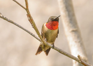
Not infrequently, I will use Lightroom to “heal” any dust spots, and to add a slight “vignetting” (darkening of the corners and edges of the image), but in this case I did not do either. Very rarely, I may also “heal” distracting elements such as intrusive twigs at the edge of an image, but I never add anything to the image, or substitute parts of the image, such as grafting the sky from another image. Nor (with the exception of the vignetting just mentioned) do I treat different parts of the image differently, such as increasing the contrast or saturation in a particular area of the picture.
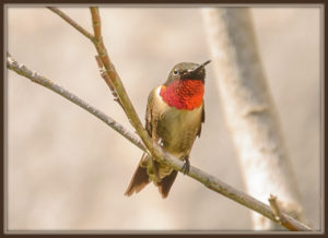
For images in my weekly essays, I usually put a border around them, using Picasa. My standard border format is an option Picasa calls “Museum Matte”, and I almost invariably select colors for both the inner and the outer border from within the image itself. In the case of our example image, that step brings us full circle to the picture as you saw it last week, repeated here as image #6.
The final three images this week take an image I have not used before. Image #7 is “straight out of the box”.
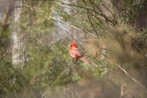
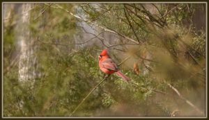
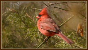
I immediately saw two possibilities for this image. One was to perform a minimal crop to 16×9 format and a limited amount of “tweaking” – image #8. This preserved the air of mystery created by “shooting through” intervening twigs and branches, which appear blurred because the were much closer to the camera than the Cardinal was and I was using a relatively large aperture (f/6.3) and focusing on the bird itself.
The other option was to crop the image much more tightly, yielding a portrait of the Cardinal, picture #9.
Have a great week!